

A higher-converting WooCommerce store is rarely created by changing one button color or adding more promotional banners. Conversion rate improves when the entire buying journey becomes clearer, faster, more trustworthy, and easier to complete. For agencies, the most effective approach is to treat conversion optimization as a structured process that combines analytics, user experience, merchandising, performance, and testing.
Start with a conversion diagnosis
Before recommending design changes, establish where shoppers are abandoning the funnel. Review the path from landing page to purchase and separate the major conversion events:
- Product view to add to cart
- Add to cart to checkout
- Checkout start to payment completion
- First purchase to repeat purchase
Use WooCommerce analytics, Google Analytics 4, server-side order data, and session recordings where appropriate. Compare conversion rates by device, traffic source, product category, customer type, country, and payment method. A store may have an acceptable overall conversion rate while mobile users or paid search visitors experience a severe drop-off.
Validate analytics before making decisions. Confirm that purchase, refund, tax, shipping, and coupon data are being recorded consistently. Agencies should also reconcile platform-reported revenue against WooCommerce orders so that tracking errors are not mistaken for user experience problems.
Improve the value proposition above the fold
Visitors should understand what the store sells, who it serves, and why it is worth choosing within seconds. Category and product pages should communicate a specific benefit rather than relying on vague claims such as “high quality” or “best selection.”
For example, a specialist coffee retailer might lead with “Freshly roasted single-origin coffee shipped within 24 hours” instead of simply displaying “Premium coffee.” The stronger statement explains the product, differentiates the business, and addresses a purchase concern.
Review the primary page heading, supporting copy, product imagery, shipping promise, returns information, and primary call to action as one message. Avoid placing competing calls to action above the fold unless the business model genuinely requires multiple paths.
Make product discovery efficient
Customers convert more often when they can find a suitable product without excessive filtering or navigation. Audit the store’s taxonomy, search behavior, category pages, and internal linking.
- Use customer language in product names, categories, and attributes.
- Provide filters that reflect real buying decisions, such as size, compatibility, material, capacity, or use case.
- Prevent incompatible filter combinations from returning empty or misleading results.
- Display useful product information in category cards, including price, availability, ratings, and key specifications.
- Configure search synonyms and redirects for common terms, misspellings, and product codes.
For large catalogs, measure search exit rate, zero-result searches, filter usage, and product-list click-through rate. These metrics often expose revenue opportunities that a general site conversion rate hides.
Build product pages around purchase decisions
A product page should answer the questions that prevent a customer from buying. The content hierarchy should make the essential information easy to scan:
- Clear product name and primary benefit
- Price, tax treatment, sale terms, and payment options
- Availability and estimated dispatch or delivery timing
- Relevant product variations and configuration choices
- Primary product imagery, video, dimensions, and specifications
- Returns, warranty, delivery, and support details
- Reviews, ratings, questions, and other trust evidence
Use WooCommerce attributes for structured product data rather than placing every variation detail in unstructured descriptions. Make variation selection accessible and explicit. If selecting a size, color, or configuration changes the price, stock status, image, or SKU, ensure the interface updates immediately and communicates the change clearly.
For products with compatibility requirements, include a compatibility checker or a concise decision guide. For example, a replacement-part store can ask for a model number before showing compatible products. This reduces unsuitable orders and gives customers more confidence at the point of purchase.
Reduce checkout friction
Checkout should request only information needed to process the order, comply with applicable requirements, calculate fulfillment costs, and provide customer service. Remove unnecessary fields and avoid forcing account creation before payment.
Useful improvements include:
- Allow guest checkout while offering account creation after the order is placed.
- Use address autocomplete where it is reliable for the target market.
- Display field-level validation messages next to the relevant field.
- Preserve entered data when validation fails or a payment attempt is interrupted.
- Show delivery costs and estimated delivery dates before the final payment step.
- Support express payment methods such as Apple Pay, Google Pay, and PayPal when they suit the audience.
- Keep coupon entry available without making customers leave checkout to search for a code.
Test checkout with real products, shipping zones, taxes, coupons, failed payments, virtual products, subscriptions, and mobile devices. A checkout that works for a simple domestic order may fail when a customer selects a different country, a backordered item, or a subscription product.
Address shipping and pricing uncertainty
Unexpected costs are a common cause of cart abandonment. Display shipping thresholds, handling fees, taxes, and delivery estimates as early as the available information allows. If exact shipping depends on the destination, explain how the calculation works instead of presenting an unexplained charge at the final step.
Free shipping can improve conversion, but it should be evaluated against margin and average order value. Agencies can model several thresholds, such as free shipping above a profitable basket value, and measure both conversion rate and contribution margin. A higher order count is not necessarily a revenue improvement if discounts and fulfillment costs eliminate the margin.
Use trust signals where objections occur
Trust elements work best when placed near the concern they address. Put delivery and returns information near the add-to-cart area, payment security information near payment fields, and warranty details near product specifications.
Effective trust signals can include verified customer reviews, user-submitted photographs, clear contact information, payment method logos, fulfillment guarantees, certifications, and transparent returns policies. Do not use unsupported security claims or imply that a payment provider guarantees the entire transaction if it does not.
Review moderation should preserve credibility. Publish legitimate negative feedback when it complies with the store’s policy, respond constructively, and identify recurring product or fulfillment problems that require operational fixes.
Improve performance without sacrificing functionality
Slow pages reduce engagement, particularly on mobile networks. Measure real-user performance using Core Web Vitals and segment results by device and geography. Focus on the templates and interactions that influence buying decisions rather than optimizing only the homepage.
- Serve appropriately sized product images in modern formats where browser support and the image workflow allow it.
- Lazy-load below-the-fold media without delaying the main product image or primary content.
- Reduce unnecessary JavaScript from page builders, tracking tools, chat widgets, and marketing plugins.
- Cache public pages while excluding cart, checkout, account, and other dynamic customer-specific content.
- Review database queries and plugin behavior on catalog, cart, and checkout requests.
- Use a content delivery network and reliable hosting appropriate to the store’s traffic and geographic footprint.
Be careful with aggressive caching and optimization settings. Test cart fragments, session behavior, logged-in customers, variable products, subscriptions, and payment redirects after every performance change.
Design for mobile completion
Mobile optimization is more than responsive styling. Test the complete purchase journey on common devices, including product selection, variation changes, quantity updates, coupon entry, address entry, payment authentication, and order confirmation.
Use sufficiently large tap targets, keep the primary action visible without obstructing content, and avoid pop-ups that cover product details or checkout fields. Make sticky add-to-cart controls conditional so they do not duplicate or obscure the main purchase interface on smaller screens.
Increase basket value responsibly
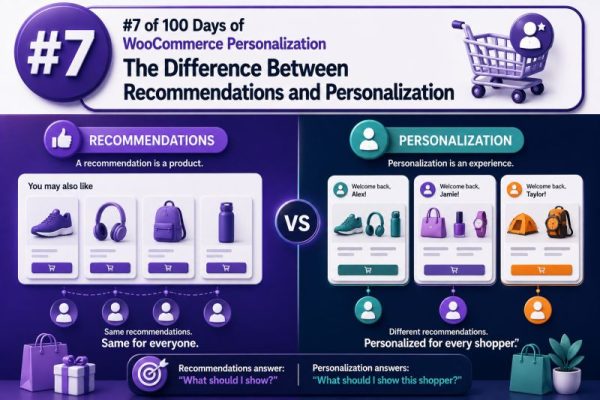
Cross-sells and upsells should help customers complete their intended purchase. Recommend accessories, refills, bundles, or upgrades that are logically related to the selected product. Avoid displaying unrelated recommendations that create decision fatigue.
Examples include a compatible case with a device, replacement filters with a water system, or a replenishment subscription with a consumable product. Test recommendations based on product relationships, customer behavior, and basket contents. Track incremental revenue, average order value, margin, refund rate, and conversion rate rather than measuring clicks alone.
Run disciplined conversion tests
Once the largest friction points are identified, prioritize experiments by expected impact, implementation effort, traffic volume, and confidence in the diagnosis. A useful test hypothesis states the problem, proposed change, expected behavior, and success metric.
For example: “Because mobile visitors cannot see delivery timing near the purchase button, displaying the estimated dispatch date in that area will increase mobile add-to-cart rate without increasing support contacts.”
Test one meaningful change at a time when possible, define the primary metric before launch, and allow enough traffic for a reliable result. Monitor guardrail metrics such as revenue per visitor, average order value, refunds, payment failures, cancellations, and customer support contacts. A variation that increases add-to-cart events but reduces completed orders or margin is not a successful optimization.
For stores with limited traffic, combine quantitative data with customer interviews, support tickets, search terms, usability tests, and post-purchase surveys. Not every valuable improvement requires an A/B test, but every major change should have a documented rationale and a way to evaluate its effect.
Turn improvements into an agency operating process
Agencies can create repeatable client value by delivering conversion work as an ongoing program rather than a one-time redesign. Establish a baseline dashboard, maintain an experiment backlog, document implementation decisions, and review performance by segment each month.
A practical workflow is:
- Confirm tracking and commercial targets.
- Identify the largest funnel or margin opportunity.
- Inspect the relevant templates, plugins, integrations, and operational constraints.
- Implement the smallest change that addresses the diagnosed problem.
- Test across browsers, devices, payment methods, shipping zones, and customer states.
- Measure primary and guardrail metrics.
- Record the result and use it to define the next opportunity.
This process connects front-end improvements to measurable client revenue while protecting checkout reliability, profitability, and customer experience.